Cognitio-Scan — Training & Development Platform
End-to-end website design for Cognitio-Scan s.r.o. — a Czech centre for NLP training, business coaching, and organisation development. A modular, conversion-focused web presence built to increase registration rates across European markets.
Client
Cognitio-Scan s.r.o.
My Role
Product Designer
Markets
CZ · SK · EN · NL · FR · DE

Project Context
Cognitio-Scan s.r.o. is a Prague-based centre for communication, awareness, and organisation development. They deliver high-impact NLP and coaching programmes across Czech Republic, Slovakia, the Netherlands, France, and Germany — but their existing website did not reflect the quality or breadth of what they offered. Navigation was unclear, there was no booking flow, and the visual identity failed to communicate the credibility and authority of their work.
A credible, conversion-focused website — turning visitors into registered training attendees.
The goal was a full website redesign: modular, conversion-optimised, and built to serve CZ, SK, EN, NL, FR, and DE markets with a consistent look and feel throughout.
Scope covered the full website: a library of 20 reusable design blocks (hero, product navigator, testimonials, FAQ, team, blog, gallery, contact form, booking popup…), a filterable training calendar supporting category, country, city, date, duration, and lecturer filters, a reservation popup integrated with every training entry, and full page compositions for homepage, product detail pages, testimonials, about, contact, and blog.
Role and Responsibilities
As Product Designer, I owned the full website design process — from analysing the brief and understanding the product portfolio, through information architecture, block system design, and high-fidelity delivery.
Discovery & Brief Analysis
Reviewed the design requirements document and audited the existing website to identify where the current digital presence failed to communicate the brand and convert visitors.
Information Architecture
Mapped 15+ training programmes across three product categories into a clear, navigable structure — 11 main navigation items, product pages, and a filterable calendar.
Block System Design
20-block component library — each block with independently optional elements (heading, photo, list, buttons) so any page can be composed without new design work.
Interaction Design
Booking popup, training calendar with 5 filter dimensions, reservation form, FAQ accordion, testimonial slider, and product navigator with CTA hierarchy.
Responsive & Localised
All blocks built with flexible grids for mobile adaptation, tested across all language variants — Czech to German — to ensure no overflow or layout breakage.
High-Fidelity Delivery
Pixel-perfect high-fidelity screens for every block state and page composition — with structured Figma layers, SVG-exportable icons, and photo-swap documentation.
Problem Definition
No Booking or Registration Flow
Interested visitors had no way to reserve a training spot directly on the website. All registrations went through phone or email — creating friction, lost leads, and no visibility into capacity.
Complex Portfolio — No Clear Navigation
15+ training programmes across three product categories were buried in unclear navigation. Visitors couldn't find what was relevant to them, and the distinction between NLP, Business, and Other Trainings was invisible.
No Localised Entry Points
Despite serving clients in 6 countries (CZ, SK, NL, FR, DE, EN), the website had no proper localisation architecture. International visitors had no targeted entry point or localised content.
Visual Identity Not Converting
The existing design did not reflect the credibility or professionalism of Cognitio-Scan's programmes. The look and feel failed to build trust with new visitors — the site did not convert.
Research & Personas
Three primary buyer personas shaped every design decision — each with distinct demographics, motivations, and communication preferences identified through the client's research.
Ester
B2C — Individual Seeker
Middle / Higher · Upper & Middle Management, employed
"I feel there is something more. I'm looking for life answers — I want to set myself free from traditions, but I don't know how."
Demographics
- Divorced or single
- Age: 30–50, lives in city apartment
- Income: above average
- Works 5 days/week, weekends for activities
Characteristics
- Introvert, idealistic, independent, trustworthy
- Expert in her field; social but not very active
- Structured; visits esoteric events & short courses
- Fatalistic; mistrusts men; hides her feelings
Core Goals
- Find life answers and personal freedom
- Self-development through NLP or coaching
- Trusted references & social proof before committing
Pain Points
- Not satisfied in her job — feels stereotyped
- Difficulty managing and motivating her team
- Relations have not been working out for her
Communication Preferences
Visual · Face to face · Testimonials & case studies · Social media · Personal reference · Triggered by recognition
Diana
B2C — Independent Career Woman
Higher · Upper / Middle Senior Management, employed
"I built my career by myself step by step. I feel there is something more — and I have hobbies, but I want to keep growing."
Demographics
- Single
- Age: 30–40, lives in modern city apartment
- Income: above average
- Works 5–6 days/week, weekends for activities
Characteristics
- Likable, humorous, open, stubborn, optimistic
- Independent, trustworthy, expert in her area
- Structured; wants to move up the career ladder
- Mistrusts men; focused on information and detail
Core Goals
- Grow beyond her current career ceiling
- Be among people; build a steady relationship
- Concrete tools — manuals, facts, case studies
Pain Points
- Often limited by her own thinking patterns
- Relations have not been working out
- Weary in communication with men
Communication Preferences
Visual · Face to face · Manuals & infographics · Blog / E-mail · Social media · Case studies · Triggered by recognition (blog)
Kilian
B2B — Manager & Team Leader
Higher · Middle Senior Management, employed
"I want to get more out of myself and my team — but I don't know how. I feel there is something more to discover."
Demographics
- Married, 2 children, dog
- Age: 30–40, lives in modern city apartment
- Income: above average
- Works 5–6 days/week; limited weekend time
Characteristics
- Likable, humorous, open, stubborn, active
- Social listener; independent; trustworthy
- Structured; wants to move up the career ladder
- A thinker; reads a lot of books; studies
Core Goals
- Develop himself and unlock more of his potential
- Package and motivate his team more effectively
- Clear information: facts, detail, concrete results
Pain Points
- Often limits himself due to his own thinking
- Fixed group of friends but limited time for them
- Future plans not clear and specific enough
Communication Preferences
Visual · Face to face · Manuals & infographics · Blog / E-mail · Social media · Case studies · Triggered by recognition (blog)
Design Process
Click each phase to expand details & artifacts

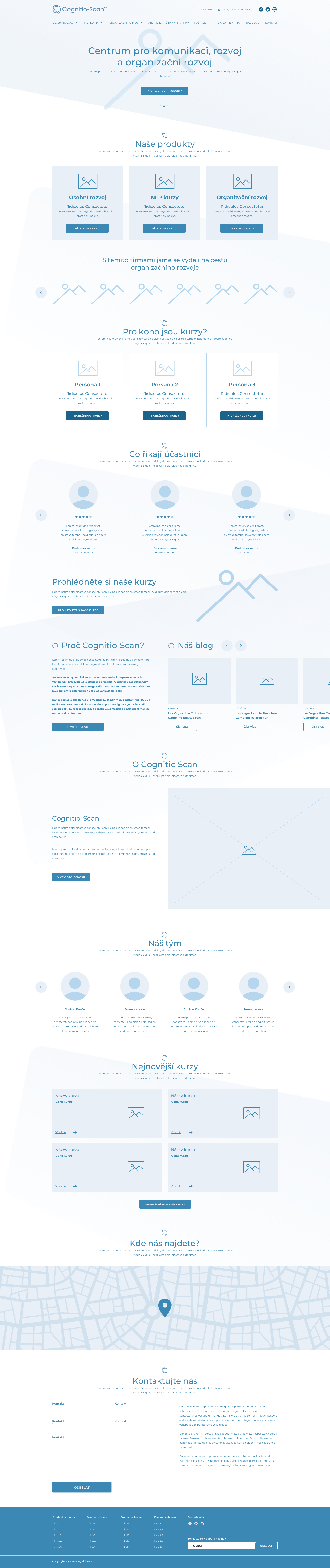
Wireframes
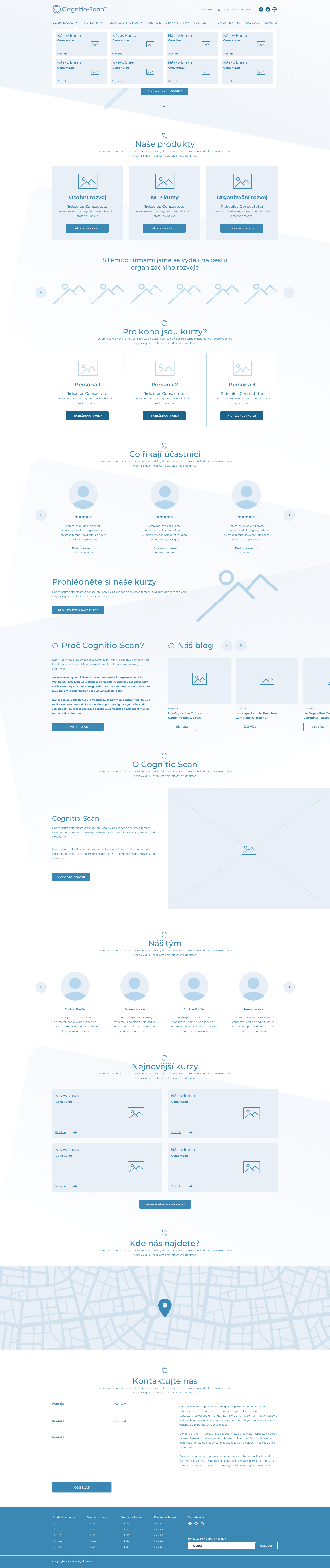
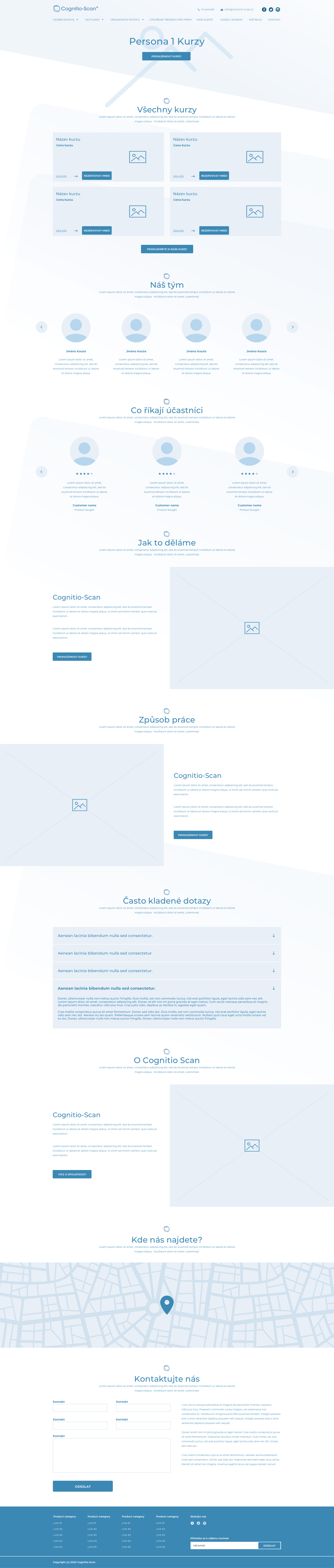
Low-fidelity wireframes capturing the core page compositions and navigation patterns before visual design.

Key Design Decisions
Modular Block System
All pages assembled from 20 reusable blocks — any element (heading, photo, list, buttons) is independently optional. New pages can be composed without any new design work.
Filterable Training Calendar
The central conversion engine — filterable by category, country, city, date, duration, and lecturer. Built to work equally well with all filters hidden on product detail pages.
Booking Popup
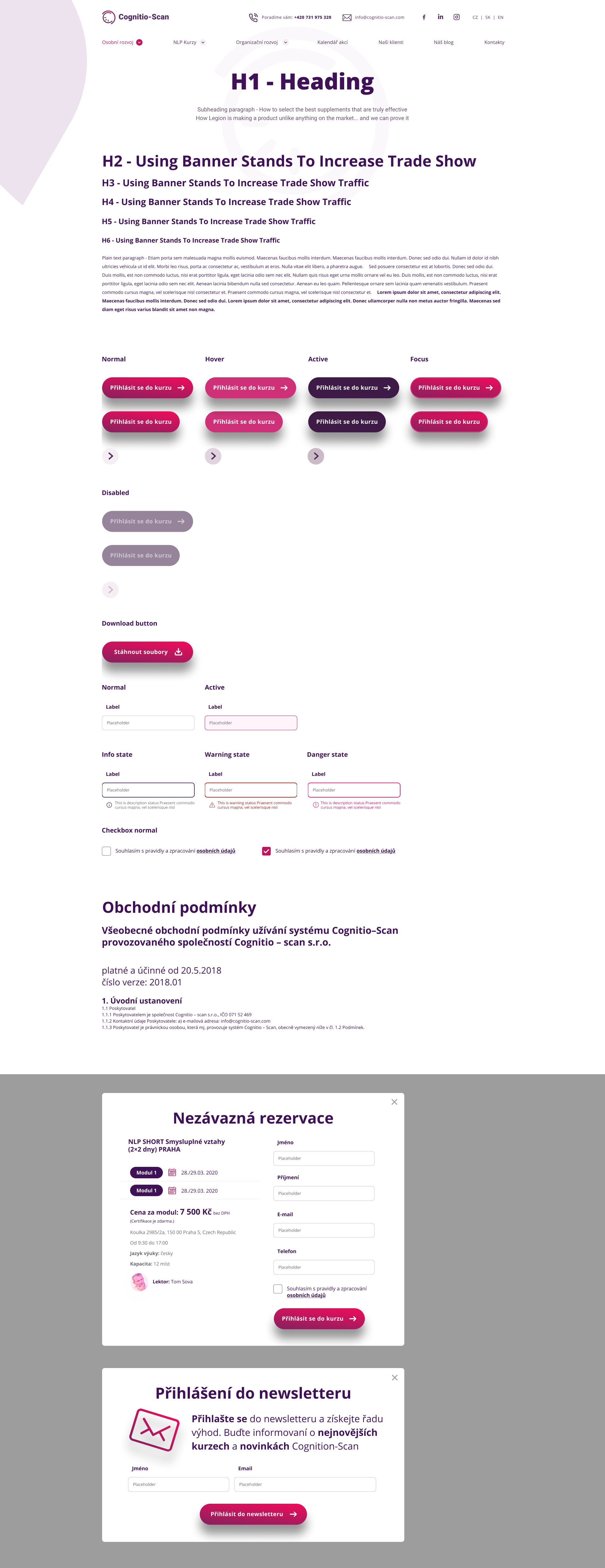
One-click reservation from any training card or calendar entry — popup pre-fills course name, address, time, lecturer, language, and capacity. Minimal friction from intent to registration.
Conversion-First Layout
Every page composition optimised for increasing registrations — prominent CTAs, trust signals (testimonials, reference numbers, case studies), and a clear path from discovery to booking.
Responsive Design
Fully responsive layouts — all blocks built with flexible grids so mobile adaptation requires zero redesign. Thumb-friendly touch targets on CTAs and calendar entries.
Photo Flexibility
Every image placement built for one-click content swap — the layout never breaks regardless of photo dimensions or subject matter. A key requirement for the client's content team.
Credible Visual Identity
Brand purple from the Cognitio-Scan logo, off-whites, and neutral greys — translated into a visual system that communicates trust and drives registration.
Final UI Design
A modular, conversion-focused website with brand purple, 20 reusable blocks, a filterable training calendar, and a booking popup.





Mobile · 375 px




Outcome / Impact
The Cognitio-Scan design successfully replaced a fragmented, conversion-weak website with a structured, modular system that scales with the company's growing portfolio. Every page — from homepage to training detail — is now assembled from the same 20 reusable blocks, making future content changes and new programme pages achievable without design intervention.
The filterable training calendar and booking popup removed the biggest barrier in the conversion funnel: interested visitors previously had no way to register online, forcing them to call or email. The new reservation flow allows anyone — regardless of language — to go from programme discovery to registration in a single session.
The purple-and-white visual identity gave Cognitio-Scan a credible, professional web presence consistent with the quality of their NLP and coaching programmes — and consistent across all markets serving their European audience.
20
Reusable Design Blocks
6
European Markets Served
10+
Page Compositions Delivered
1
Unified Visual System
Before, if someone found us online and wanted to book a training, they had to call us. Now the website does that work. The block system means our team can build new pages without waiting for a designer, and the calendar shows everything in one place — across all our locations and languages.
Cognitio-Scan Leadership
Praha 5, Czech Republic
Let's Build Something Great
Interested in working together on a web design project or marketing platform? I'd love to hear about your challenge — I typically respond within 24–48 hours.