
DesignOps · Banking · Design Systems
Komerční banka — DesignOps Overhaul
Transforming the design organisation of one of Czech Republic's largest banks — building a unified design system, establishing DesignOps governance, and scaling design capability across 15 product teams over 18 months.
15
Product Teams Aligned
60%
Handoff Time Reduced
200+
Components Built
18mo
Engagement Duration
The Challenge
Komerční banka had grown its digital product portfolio significantly, but design was fragmented across multiple teams with no shared system, inconsistent visual patterns, and deeply painful designer–developer handoff processes. The organisation was shipping at pace, but quality and consistency were deteriorating. New features were being designed in isolation, leading to divergent UIs within the same product and mounting technical design debt that nobody had time to address.
The Approach
I led the complete DesignOps transformation — auditing the existing design landscape across all 15 teams, architecting a comprehensive design system from the ground up, establishing governance frameworks and contribution models, and progressively enabling every team to adopt consistent, scalable design practices. The system was built in Figma with a robust token architecture (using Figma Variables) to support full light/dark theming and multi-brand extensions across the KB Group portfolio.
"Jakub transformed not just our design tooling — he changed how we think about design as an organisational capability. The system he built became the backbone of everything we ship."
Tomáš Novák, Head of Digital Products, Komerční banka

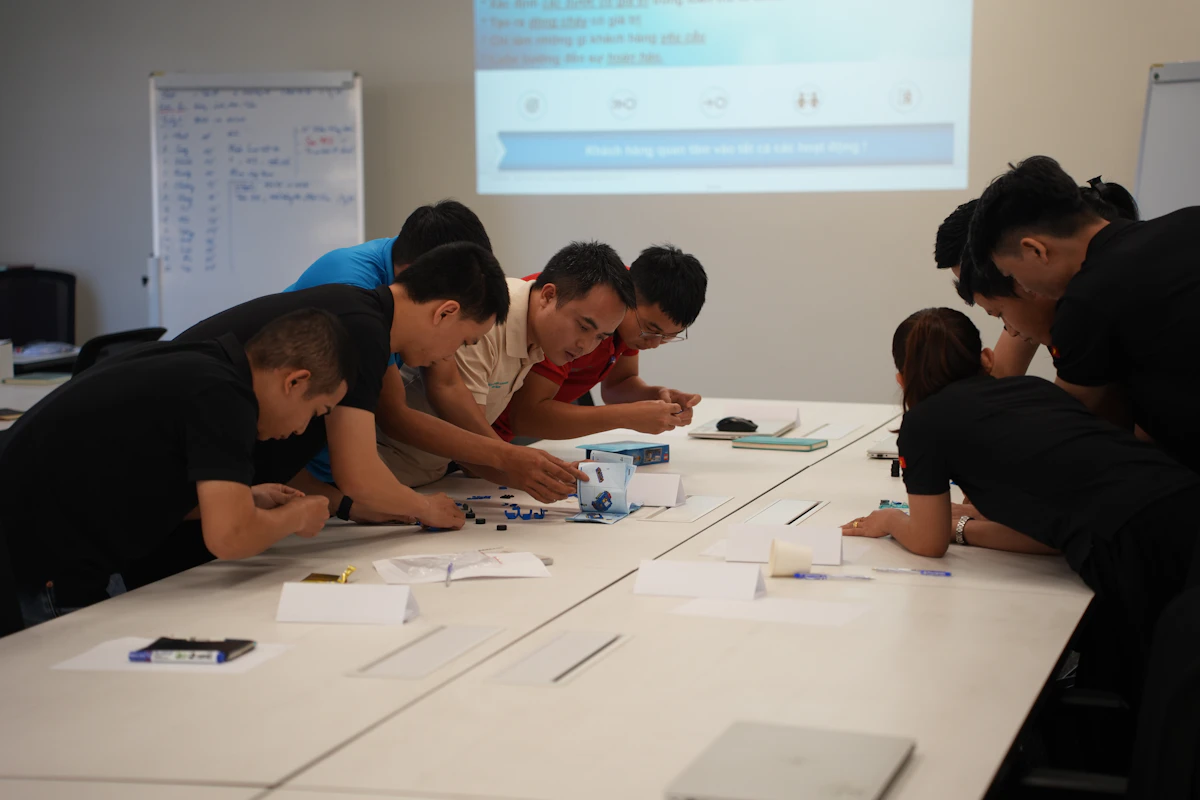
Design system Figma workspace, token taxonomy documentation, and governance workshops conducted with cross-functional teams across KB.
Token Architecture
Three-Tier Token Taxonomy — Global → Semantic → Component
color.primary
Primary actions & links
color.surface
Page backgrounds
color.danger
Errors & destructive
color.success
Confirmations
color.text.default
Body text
color.border
Dividers & outlines
button.bg.primary
↳ color.primary
button.text
↳ color.text.onDark
input.border
↳ color.border
input.bg
↳ color.surface.raised
card.bg
↳ color.surface
badge.danger.bg
↳ color.danger
Figma Variables
Real-Time Light / Dark Theme Switching
Komerční banka
Design System · Component Preview
All color values sourced from Figma Variables — zero manual updates required
Process & Methodology
Audit & Discovery
Comprehensive audit of KB's 15 product team outputs, existing Figma libraries, component duplication patterns, and handoff workflows. I mapped 300+ unique UI patterns being used in production across the estate — a critical first step that made the scale of the problem viscerally clear to leadership.
Foundation & Token Architecture
Designed a robust design token system covering color, typography, spacing, elevation, border-radius, and motion. Used Figma Variables to support real-time light/dark theme switching and laid the groundwork for multi-brand theming across the KB Group portfolio.
Component Library Build
Built 200+ components across six categories (primitives, form elements, data display, navigation, overlays, and marketing) — each with full variant support, interactive states, accessibility annotations, and Storybook-ready engineering specs.
Governance & Adoption
Established a Design System Council, contribution process, and regular system office hours that transformed the DS from a single-team project into an org-wide platform. Created documentation standards and ran adoption workshops with every product team.
The Audit — Mapping the Design Landscape
The engagement opened with a forensic audit across all 15 product teams. I collected every active Figma file, mapped component inventories, and cross-referenced designs with production code to identify where patterns diverged. Through 30+ stakeholder interviews — spanning design, engineering, product management, and business leadership — I built a picture of where the pain was sharpest and what the highest-leverage interventions would be. The audit produced a publicly shared "State of Design" report that became a pivotal document in securing executive buy-in for the transformation.
Token Architecture & Theming
The design system's foundation was a meticulously structured token taxonomy — global tokens (raw values), semantic tokens (purpose-driven aliases), and component tokens (scoped overrides). Using Figma Variables, we achieved true real-time theme switching across all 200+ components. The architecture was intentionally extensible: KB's sister brands could inherit the core token set and override only the brand-differentiating values, giving the KB Group a scalable multi-brand design platform built on a single codebase.
Component Library — Scale with Quality
Every component in the library was built to meet four non-negotiable requirements: complete accessibility (keyboard navigation, screen reader support, colour contrast to WCAG 2.1 AA), full interactive state coverage (default, hover, focus, active, disabled, error, loading), engineering handoff completeness (spacing redlines, token mapping, behaviour documentation), and design variant flexibility (supporting all documented use cases without ad-hoc overrides). Components were reviewed by KB's engineering leads before merge, creating accountability on both sides of the design/engineering divide.
Governance — Making It Last
A design system without governance becomes technical debt within months. I established a Design System Council with rotating representatives from five of the largest product teams, who shared responsibility for system direction alongside a dedicated DS designer. The contribution process was designed to be lightweight but rigorous: clear criteria for when a pattern warranted systemisation, a proposal template, a review checklist, and a staged release process. System office hours ran weekly and became a critical forum for resolving ambiguity between teams.
Component Library
200+ Components Across 6 Categories — All with Variants, States & Accessibility Annotations
Primitives
Form Elements
Data Display
Navigation
Overlays
Marketing
Total: 168 explicitly catalogued + additional variants
Governance Framework
How the Design System Was Made to Last — Roles, Responsibilities & Operating Cadence
RACI Structure
DS Core Team
OwnerMaintain, build, release
DS Council
GovernorDirection, prioritisation, contribution review
Product Teams
ContributorConsume, contribute proposals, report issues
Engineering Leads
ReviewerCode review, token implementation sign-off
Operating Cadence
Design System Office Hours
Open Q&A, ambiguity resolution, live system demos
Council Review Meeting
Contribution proposals, roadmap alignment, metrics review
DS Newsletter
New releases, breaking changes, adoption stats, team spotlight
Health Dashboard
Coverage metrics, adoption rates, open issues, NPS from teams
Impact Metrics
Before vs. After — 18-Month Transformation Outcomes
Handoff time reduced
-60%Design consistency score
+57ptsTeams on DS (of 15)
100%Component reuse rate
+66ptsKey Deliverables
Design System v1.0
200+ Figma components with full variant support, interactive states, and token mapping. Delivered with complete Storybook specs.
Token Architecture
Three-tier token taxonomy (global → semantic → component) with Figma Variables powering full light/dark theming.
Governance Framework
Design System Council charter, contribution process, review criteria, and decision-making RACI.
Documentation Suite
Component usage guidelines, do/don't examples, and accessibility annotations in Figma and Confluence.
Adoption Programme
Phased onboarding playbook and team-specific migration guides for all 15 product teams.
State of Design Audit Report
Executive-ready analysis of the pre-transformation design landscape with prioritised improvement roadmap.
Outcome & Reflection
The KB DesignOps engagement remains one of the most complex and rewarding projects of my career. What began as a request to 'clean up the design file' evolved into a fundamental transformation of how an 800-person bank thinks about design as an organisational capability. The design system I built is still in active use and continues to evolve — the best possible sign that the governance model took root.
Interested in working together?