DataWarehouse — Website Design
End-to-end website design for DataWarehouse — a business intelligence and data analysis platform. No prior website or design assets existed. I mapped all site goals from scratch, defined the full information architecture, and designed a responsive marketing website built to convert prospects into demo requests.
Client
DataWarehouse
My Role
Product Designer · UI/UX Designer
Platform
Website · Responsive
Starting Point
No previous design
Project Context
DataWarehouse is a business intelligence and data analysis platform — helping organisations report, analyse, and visualise data from integrated, centralised sources. The platform's tagline: "Report and data analysis, as a core component of business intelligence." Key capabilities include a Query builder, Data export, and Visualized designer.
A complete website — built from zero.
There was no previous website or design. The challenge was to first map what the website needed to achieve, then define the full information architecture, and finally design a responsive, conversion-focused marketing site — all from a blank canvas.
Scope covered the full site: Landing page (with App showcase, Why buy, Who uses it, Why different, How it works, Try/Order Demo, References, Pricing sections), About page with team, App features, Success stories (CBRE and others), Education, API & Implementation, Licenses, Pricing, and Contact — all designed responsively across desktop, tablet, and mobile.
Role and Responsibilities
As Product Designer and UI/UX Designer, I owned the full website — from goal mapping and information architecture through visual design, responsive layout, and developer-ready Figma handoff. There was no existing design to build upon.
Goal Mapping & IA
Mapped all website goals from stakeholder requirements, defined every section's purpose and user intent, and created the full information architecture before any design began.
Design System from Scratch
Built a complete visual identity and component library — dark navy/blue brand colour, typography, icon set, and all reusable marketing components — with no prior assets.
Conversion-Focused Landing Page
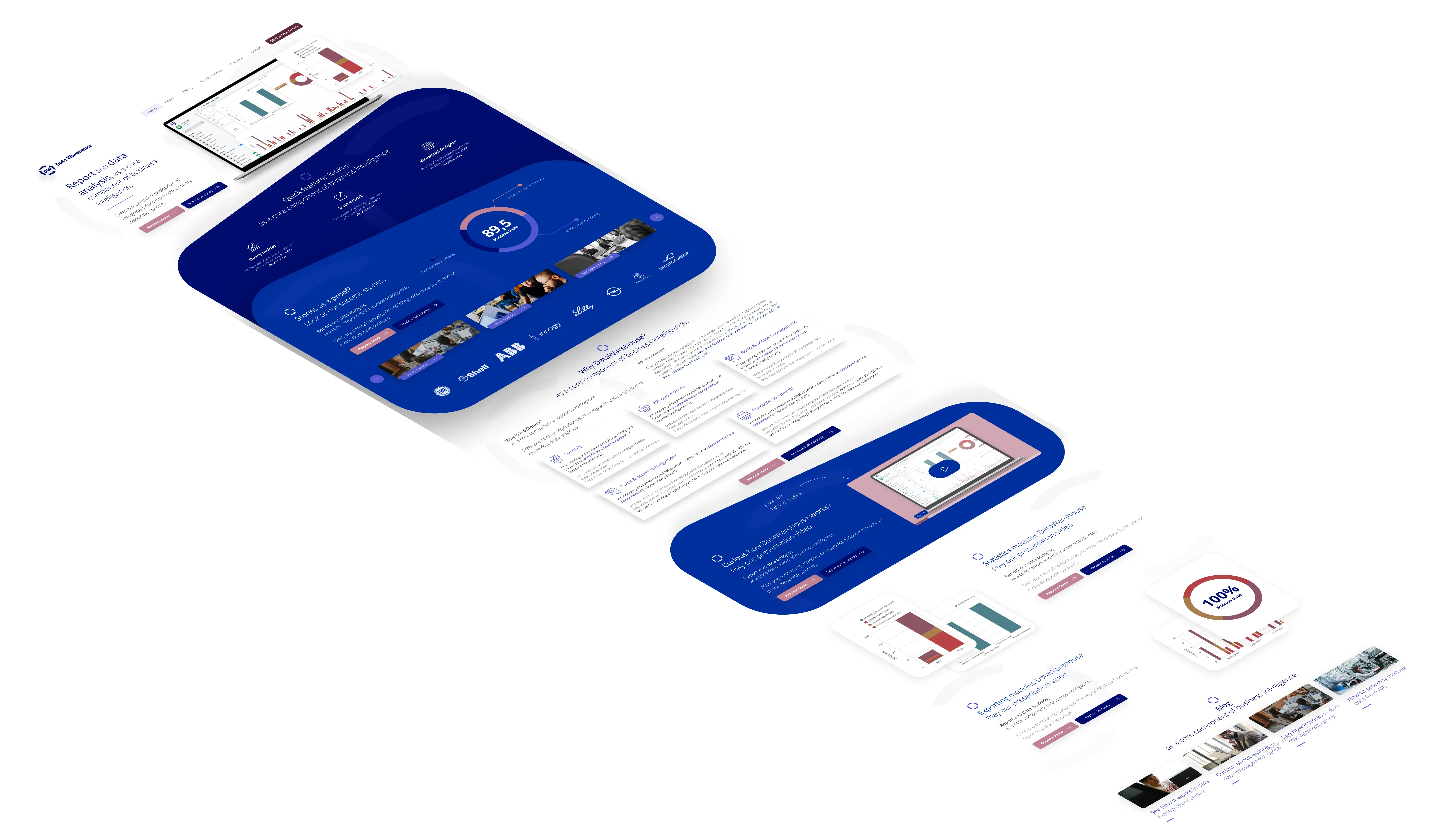
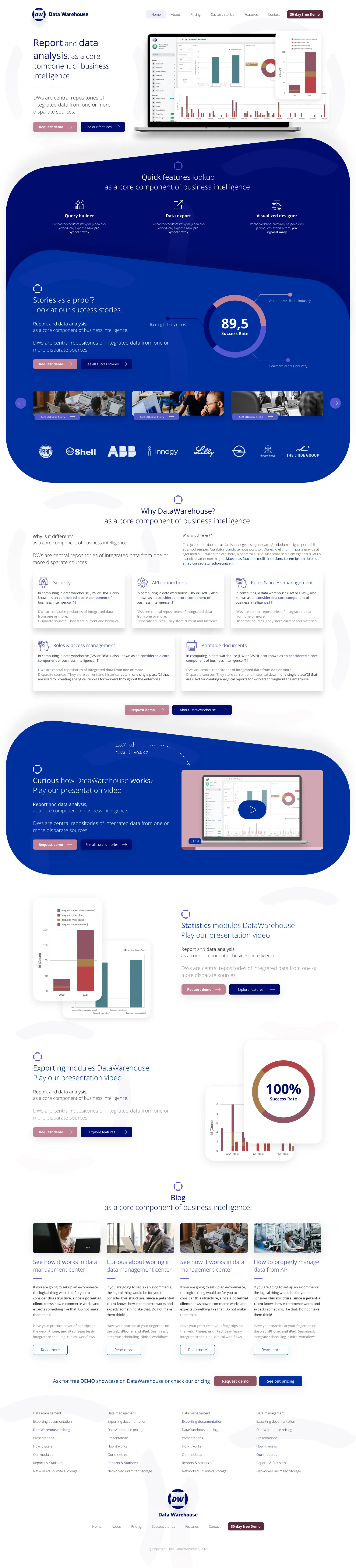
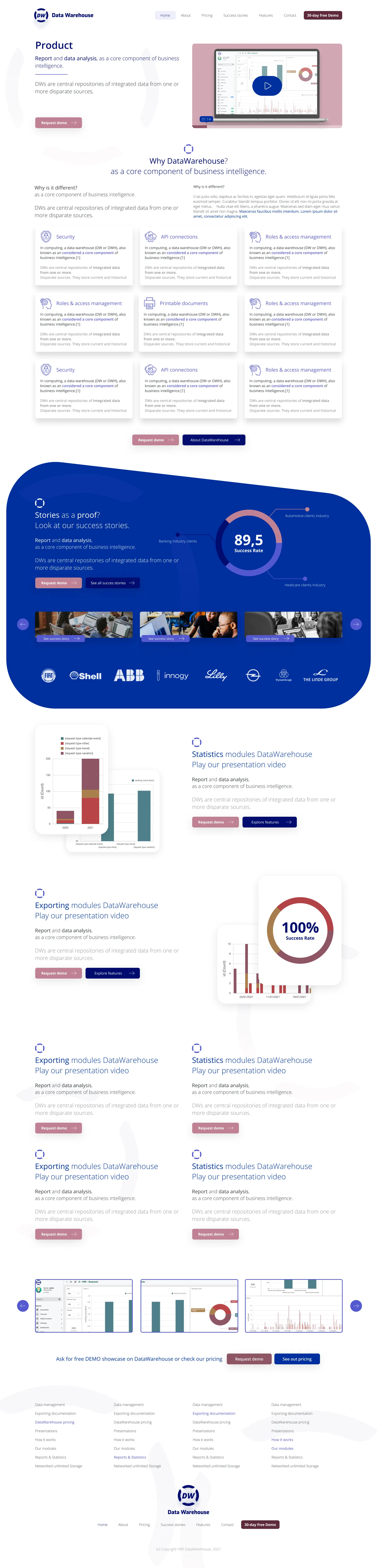
Designed the homepage hero with a clear BI value proposition, key platform metrics, client reference logos, a quick feature strip, and a prominent trial CTA — structured to convert first-time visitors.
Feature & Module Pages
Individual pages for all app features, modules (Exporting, Statistics/Reporting), How it works, API & Implementation, and Education sections.
Success Story Architecture
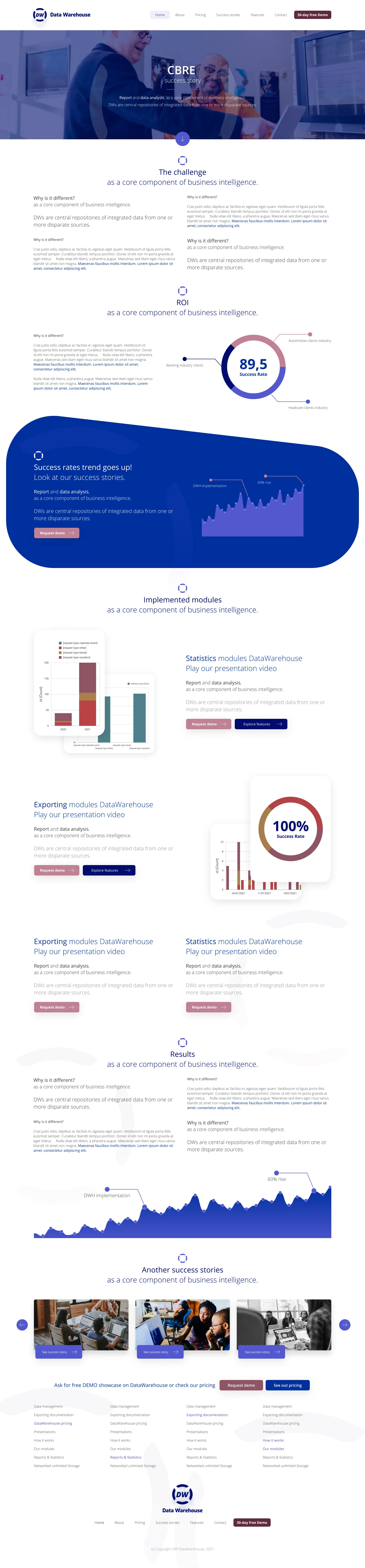
Designed the success stories section and individual case study templates — with CBRE as the primary example — including challenge, score metrics, and implemented modules.
Responsive Design
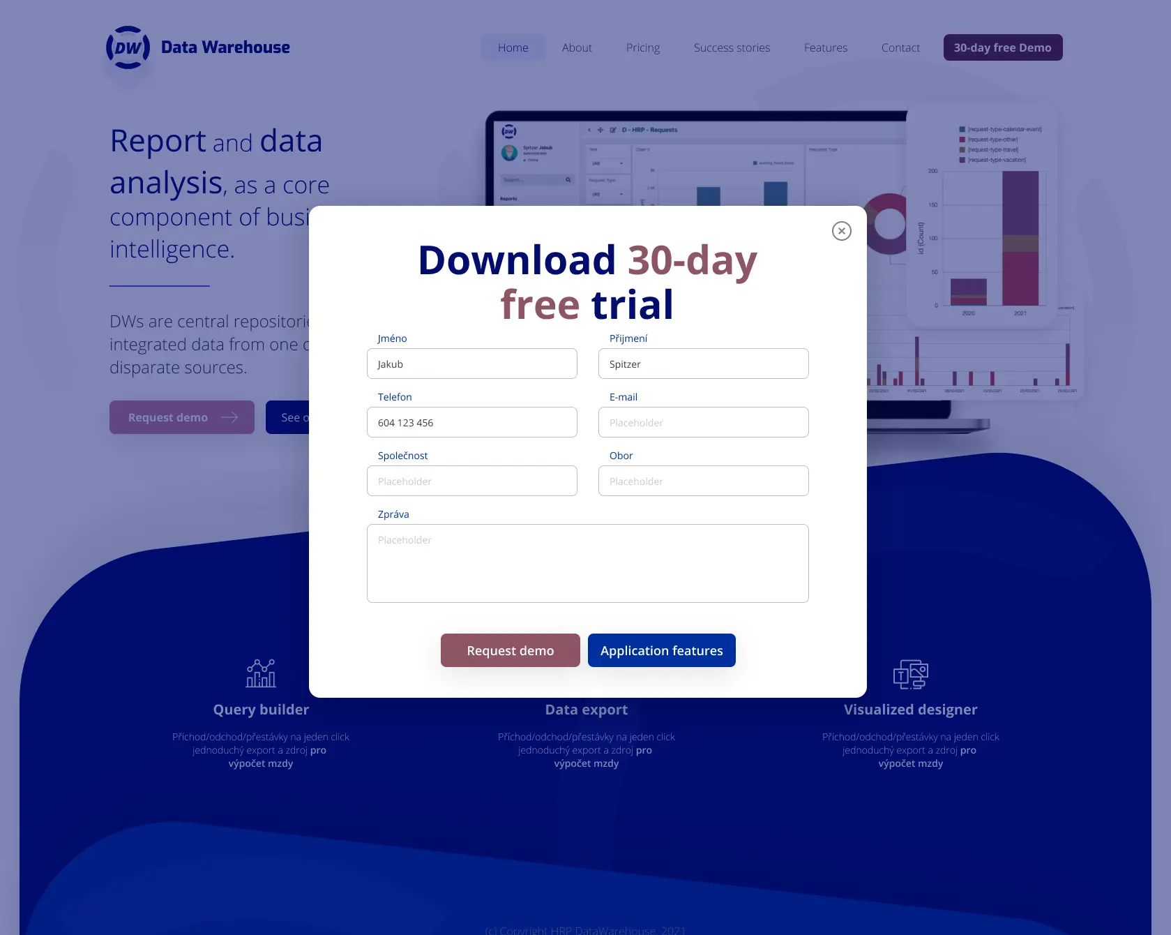
All pages designed across desktop, tablet, and mobile breakpoints — including the Czech-language contact form, Prague office page, and a demo request modal overlay.
Problem Definition
No Existing Design — Starting from Zero
The product had no website and no design assets. Every decision — brand, structure, content, and conversion flow — had to be created from zero, with no prior benchmarks or reference points.
Complex Product, Simple Story Needed
DataWarehouse offers reporting, query building, data export, and visualisation across multiple modules. Distilling this into a clear, compelling hero message and logical site structure was a core design challenge.
Multiple Distinct User Personas
The platform serves Data Analysts, IT Directors, and Business Executives — each with fundamentally different information needs, requiring a thoughtfully structured IA to serve all three without overwhelming any.
No Online Credibility Baseline
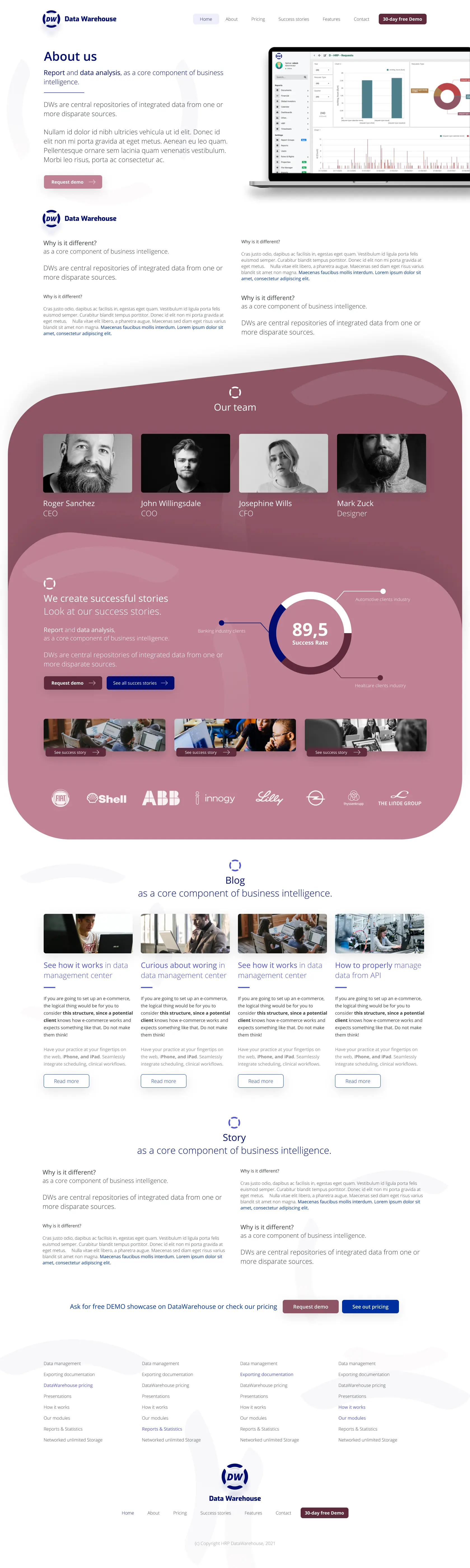
As a new entrant with no online presence, the website had to immediately establish trust and credibility — through client references, quantified platform metrics, and team transparency on the About page.
Research & Personas
Goal mapping and persona research identified three distinct user archetypes visiting the site — each with different information needs, requiring separate content tracks and conversion paths through the information architecture.
Lucie Kratochvílová
Data Analyst / Manager
"I want to see the actual product — real queries, real exports, real dashboards — before I even consider booking a demo."
Core Goals
- App showcase with real screenshots
- Feature details: query builder, data export, visualizations
- Clear how-it-works documentation
Pain Points
- Generic marketing descriptions
- No product previews or demos
- Can't evaluate capability without booking a call
Martin Procházka
IT Director
"I need API details, implementation scope, and licensing before I can escalate this to procurement."
Core Goals
- API & implementation documentation
- License structure and pricing transparency
- Education resources for onboarding
Pain Points
- No technical documentation visible
- Pricing hidden behind a sales call
- Implementation timeline completely unclear
Jan Šimánek
VP / Business Decision Maker
"Show me the ROI — I need success stories with real numbers and recognisable client names before I can justify this to the board."
Core Goals
- Customer success stories with clear outcomes
- Platform performance and reliability metrics
- Pricing estimate or model
Pain Points
- No outcome data from real customers
- Client references missing or generic
- No sense of ROI or business case
Design Process
Click each phase to expand details & artifacts

Site Architecture & Design Direction
The Landing Page was designed as the central hub — connecting to 8 topic areas, each with defined sub-pages and conversion paths routing back to the Try/Order Demo CTA. The visual design paired a dark marketing aesthetic with light product documentation pages.
Central entry point · 8 topic areas · all conversion paths → CTA
Key Design Decisions
Single Primary CTA Across All Pages
A consistent, persistent trial CTA was placed on every page and section — offering immediate, low-barrier access to the product and serving as the primary conversion goal throughout the entire buyer journey.
Key Metrics as Homepage Social Proof
Quantified platform performance metrics were placed prominently on the homepage as the first credibility signal — giving visitors an instant, data-backed reason to keep exploring before scrolling any further.
Quick Features Strip
Three core capabilities — Query builder, Data export, and Visualized designer — were surfaced immediately below the hero as a scannable feature strip, answering "what does it actually do?" before visitors scroll further.
Client Reference Bar for Instant Credibility
Reference logos from existing clients were placed near the top of the homepage — immediately signalling market adoption and building trust with new visitors evaluating the platform for the first time.
Personas Told Through Success Stories
"Who will use it?" was structured using real client success stories as persona vehicles — showing the product working in context for each user type rather than abstract persona descriptions.
Module-Level Page Architecture
Individual module pages (Exporting, Statistics/Reporting) gave technical users the depth they needed — with specific feature breakdowns, chart previews, and direct CTAs from each module.
Czech-Language Contact Form
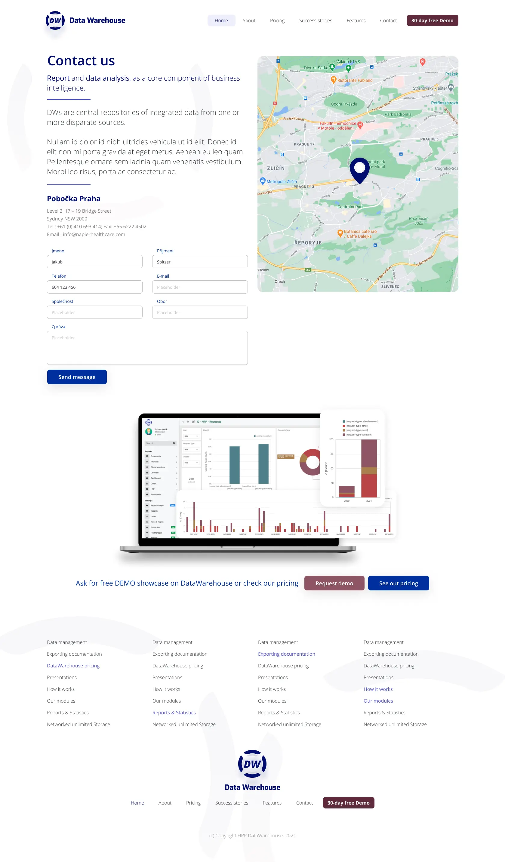
The contact page was designed with Czech-language field labels (Jméno, Příjmení, Společnost, Obor) — reflecting the primary Czech market while the layout remained internationalisation-ready.
Reliability Metrics in Module Pages
Performance and reliability statistics were featured prominently within individual module pages — turning technical product data into visible trust signals that proactively addressed procurement concerns.
Final UI Design
A complete website designed from scratch — covering the full landing page, all feature and module pages (Exporting, Statistics), success story templates, About page with team, Czech-language contact, and responsive breakpoints.
Outcome / Impact
The DataWarehouse website was designed entirely from scratch — no prior design, no prior website. By starting with a structured goal-mapping and information architecture phase, every page had a clear purpose, a defined audience, and a logical conversion path before a single design decision was made.
The BI platform's complex capabilities — reporting, query building, data export, and visualisation — were distilled into a clear, scannable homepage with key platform metrics as the centrepiece social proof and three quick features (Query builder, Data export, Visualized designer) surfaced immediately below the hero.
The complete website covered the landing page hub, all product and module pages, success story templates with CBRE as the lead case, team and about pages, a Czech-language contact form, and a demo request modal — all delivered responsively across three breakpoints with full Figma handoff.
9
IA Topic Areas Mapped
3
Target User Personas
10+
Page Templates Delivered
3
Responsive Breakpoints
Starting from zero forced us to make every structural decision deliberately. The information architecture phase was what made everything else possible — once we knew exactly what each section needed to achieve, the design almost wrote itself.
Jakub Spitzer
Product Designer · DataWarehouse Website
Let's Build Something Great
Interested in working together on a website design project or enterprise platform? I'd love to hear about your challenge — I typically respond within 24–48 hours.